React Native meets iPhone X
November 4th, 2017
7 min read


I am currently working on a React Native application for a client that was scheduled to be released...yesterday. Well, you’ve probably been in my shoes before. We, developers, tend to provide optimistic estimations to our clients, but there is always an unexpected and unfriendly force that can cross our paths. In this case I am talking about the release of the new iPhone X and the implications that it carried out.
We are focusing on iOS release for now, holding Android off for later, so dealing with the latest toy from Apple was a must. Having been testing so far with other iPhone standard models just to focus on finishing all the required functionality, I had not paid much attention to the new screen resolution brought to the scene. Needless to say, the whole team already got hold of the new phone, so they wanted to see the application shining in the new extroverted screen.
In this article I will provide some practical guidance when it comes to adapt your React Native application to the new iPhone X, specifically when using react-native-navigation. If you are using react-navigation, you are lucky because they already handle some things for you, so you probably can skip some parts of the article.
Enabling full screen native resolution
The first thing you need to do is to configure Xcode to enable full screen native resolution in your application. If you don’t do that, your application will run on legacy mode on your iPhone X, which means it won’t take advantage of the whole screen capacity. For the setup you have two options, both involving playing with the launch screen.
Launch Storyboard file
If you don’t have one already, create a new storyboard file on your root project folder, name it LaunchScreen.storyboard
and set it as the Launch Screen File, following the screenshot below:
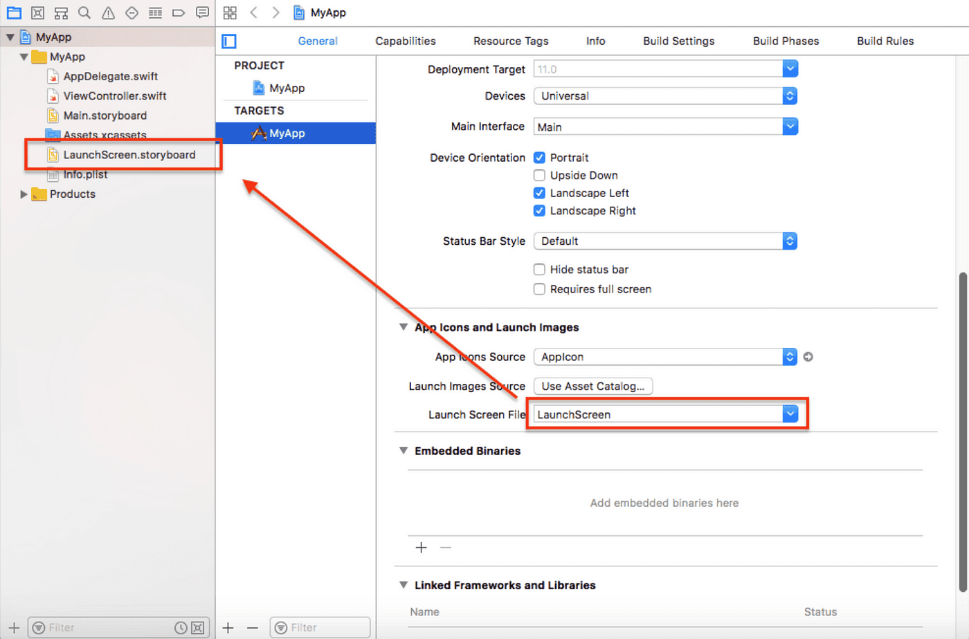
After that, open the side menu on the storyboard file, go to “Interface Builder Document section” and make sure to select “Use Safe Area Layout Guides”.
Properly sized launch image file
If your designer provided you instead a set of images to be the corresponding splash screens for the different phone sizes, reach out to him, so that he provides you two new ones with exactly the following dimensions:
- IPhone X portrait: 1125px × 2436px
- IPhone X landscape: 2436px × 1125px
Then add them to your LaunchScreen image set, which is located under Images.xcassets folder on your project root and rebuild your app.
Note: If you still want to support iOS versions prior to 11.0, set the deployment target to a lower version that suits your requirements. Otherwise, your app won’t work on those devices.
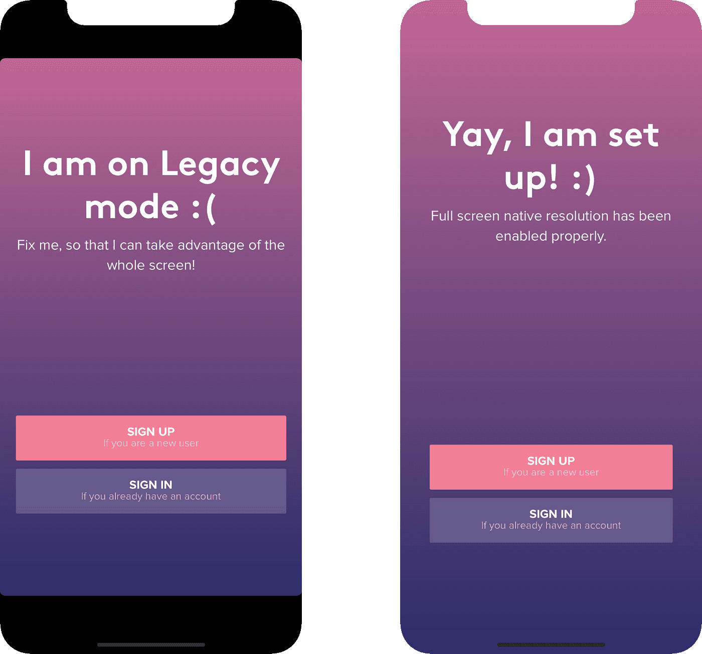
And that’s it, you are all set to maximise your experience with iPhone X! After that your layout should look like the one on the right.
Adapting your screens
"When designing for iPhone X, you must ensure that layouts fill the screen and aren’t obscured by the device’s rounded corners, its sensor housing, or the indicator for accessing the Home screen".
Since we just provided a full-screen experience, now all your screens will try to fit all the available space. However, it’s essential to inset the content to prevent clipping by the corners or the device’s sensor housing, or to avoid overlapping with the indicator for accessing the Home screen, which in other words means to restrict the content of the app to the limits of the so-called Safe Area.
What does it stand for? you can have a visual representation in both orientations below:
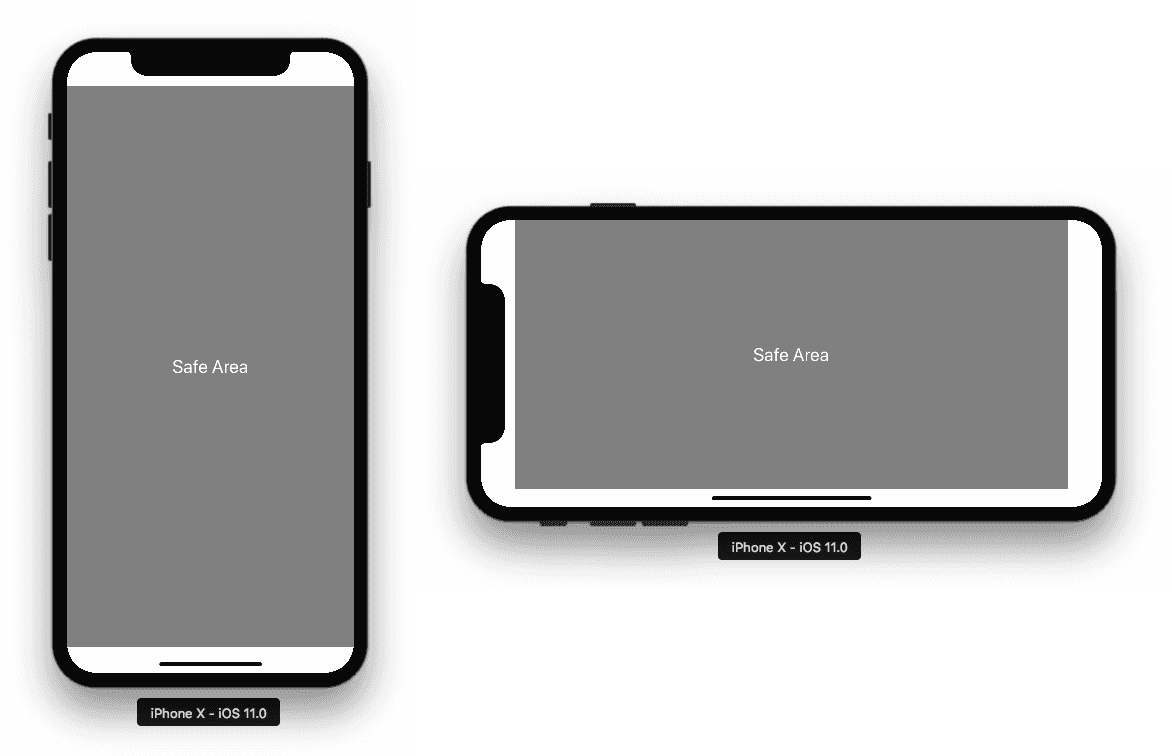
The unsafe area metrics, in density independent pixels, are:
- Portrait: top 44dp, bottom 34dp
- Landscape: left and right 44dp, bottom 24dp
Solutions available
You may wonder whether React Native or the community itself already provided a solution to deal with the IPhoneX screen and the answer is…yes and no.
As of version 0.50, React Native ships with a component called SafeAreaView, whose goal is to handle automatically
your app’s issues related to iPhone X limitations. However, it’s only available from version 0.50 on and most of us
will be probably running a lower version of the platform.
Fortunately, there is a npm library that is compatible with lower versions, react-native-safe-area-view, that is a JS based alternative solution. Still, it presents some issues with its package.json dependencies and even though there is a PR to fix that, it has been opened for a week without action taken, so you can’t always rely on the library author because he may be busy with other things.
Being that said, in the event of running into a situation like that and thanks to our dear MIT license, you can always fork the library or extract the utilities and make them part of your codebase. I proceeded with the latter due to how small the library was.
Practical usage with react-native-navigation
The approach that react-native-navigation follows is to have different native screen containers and hence different react root views (one per native container), as opposed to react-navigation where there is only one native container and one react root view for your whole application. Nader Dabit’s article is a great introduction to the latest adaptations react-navigation made to integrate nicely with iPhone X.
SafeAreaView works as wrapper component for the views you want to be safe from the top notch and bottom bent.
<SafeAreaView>
  <YourTopParentView />
</SafeAreaView>
Doing that manually for several tens of views is a bit tedious, so it’s better to create a Higher Order Component
that we can use on the entry point and apply it to our view containers. Also, it’s recommended to set the backgroundColor
on the SafeAreaView style to the background color of your app, so that the unsafe areas match the app theme.
hoistNonReactStatics is used to hoist the statics that react-native-navigation relies on in order to style the navigator.
import React from "react";
import hoistNonReactStatics from "hoist-non-react-statics";
import SafeAreaView from "lib/react-native-safe-area-view";

export default function withSafeAreaView(WrappedComponent) {
  function EnhancedComponent(props) {
    return (
      <SafeAreaView style={{ flex: 1, backgroundColor: "#CCC" }}>
        <WrappedComponent {...props} />
      </SafeAreaView>
    );
  }
  return hoistNonReactStatics(EnhancedComponent, WrappedComponent);
}
Then you’d wrap all your screens as:
Navigation.registerComponent(
  "example.home",
  () => withSafeAreaView(Home),
  store,
  Provider
);
If you are using a bottom tab based application, react-native-navigation already respects the bottom Home indicator,
so you don’t have to worry about that. Otherwise, SafeAreaView would also push the content up to avoid interference with it.
If we take a look at the right screenshot, we can see how the content has been pushed down 44dp with respect to the left screenshot. Also, worth noting that the component won’t have any effect on other iPhone devices, nor on Android.

Customise as per your needs
If you also have custom layouts and want to have more flexibility, you may find convenient some utility that determines whether your app is running on iPhoneX or not at any point of time.
An example of that could be a video player, where you would like to have a more granular control over how the elements are placed on an iPhoneX screen, such as having the video in full screen mode, a custom bar height depending on orientation, variable position of controls, a floating close button positioned absolutely between the safe and unsafe area, etc.
For that we can use the below snippet of code, slightly modified from react-native-safe-area-view, since the library keeps it as implementation detail and doesn’t export it as API:
import { Dimensions } from 'react-native';

// See https://mydevice.io/devices/ for device dimensions
const X_WIDTH = 375;
const X_HEIGHT = 812;

export const isIPhoneX = () => {
  const { height: D_HEIGHT, width: D_WIDTH } = Dimensions.get('window');

  return Platform.OS === 'ios' &&
    ((D_HEIGHT === X_HEIGHT && D_WIDTH === X_WIDTH) ||
      (D_HEIGHT === X_WIDTH && D_WIDTH === X_HEIGHT));
}
Wrapping up
Go ahead and adapt quickly your application to iPhoneX new screen! I did it in less than a day and the reward can be huge. Your iPhoneX users will be delightful and Apple will be happy too when you submit your app for review :)
If you found this article useful, follow me on Twitter @rgommezz for React Native updates and more content like this.
Happy coding! ❤️